Use it or Lose it – Photo Inspiration
The new Use it or Lose it Challenge is to be inspired by this photo:
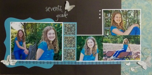
I have to say, the colors really got to me…bold and bright and I immediately thought Lagoon and Black.  Here is the layout that I came up with:
Supplies used are all CTMH unless otherwise noted: Black, White, and Lagoon cardstock, Paper Packet, Sparkle Flourishes, Clear Sparkles, Bitty Sparkles, Just Blooms Paper Shapes – Flutter, Damask Tiles stamp set, Boutique Borders stamp set, Black ink, Art Philosophy Cricut Collection, and Making Memories Heidi White Rubon Letters.
I started with a Page Map from November 2011.  I knew the colors I wanted to use and paper with those colors was not coming to mind so I figured I would be stamping some patterns.  Then, I ran across a pack of Veranda paper.  Now I never, ever, ever would have thought I would be using Juniper and Lagoon on the same layout but somehow this works out and is completely inspired by the top photo!
I REALLY wanted to stamp/emboss my title in white with the Bohemian Alphabet but it was the last thing I added to my layout and I chickened out and ended up using white rubons instead.


Loving the black and turquoise!