March 2012 Technique Blog Hop – B&T Duo Designs
Welcome to our Technique Blog Hop! This month we are highlighting the B&T Duos Designs as Embellishments  Technique as shown on page 21 in the Spring/Summer 2012 Idea Book!  Cut portions of your B&T paper and use as embellishments on your project.  This is something I love to do!
This blog hop is a great big circle so you can start wherever you want and continue through to see all the fabulous artwork incorporating this technique.  So if you are starting here, just continue until you make your way back.  If you have already started, you should be coming from Joy’s Blog.  If you get lost along the way, go to my previous post for a list of all participants.
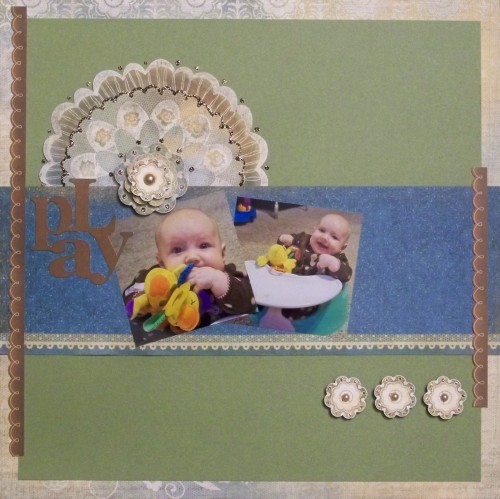
Supplies used: Florentine Paper Packet, Opaques Mocha Adhesive Gems, 3-D Foam Tape, Bronze Glitter Glitz, and Graphically Speaking Cricut cartridge.
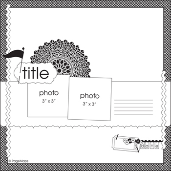
I used this March 2012 Page Map sketch:
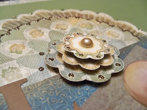
This is one of my favorite techniques!  There are so many beautiful papers and turning them into even more beautiful embellishments to accent your page is so much fun.  I cut all the flowers, large and small, from two different Florentine papers.  A trick to cutting is to be sure to use a good scissors and when cutting move your paper (not the scissors) especially when cutting circles or curves.  I embellished my cutouts with glitter glitz and added pearls.  I used the 3D foam tape to add some pop to my page.  You can see the details in the first picture at the top of this post.  There are so many other things that you can do…you can cut borders, add Liquid Glass, Sparkles. buttons, brads, the list is endless!
We would love to see what you’ve created using this month’s technique, please visit Technically Terrific where you can share your project and be entered in a chance to win great prizes.
Thanks for stopping by! Please continue onto Tracey’s Blog where you will find some additional artwork highlighting this technique! Be sure to leave a comment and let me know what you thought of my variation and happy hopping!



Amazingly beautiful, great take on the sketch
I like how you took the same basic image from the paper in various sizes and then stacked it. It makes it pop so much better!
gorgeous, Wendy- really proper use of that Flourentine medallion to the Nth degree!
LOVE it! so elegant and simply. Using the same image in descending sizes to give depth is a great idea. thanks for sharing!
Love the Layout Wendy! Nice use of design and colors!
And the cutie pie in the photo is precious
Gorgeous layout love the embellishment
Wow – love the stacking of the images in different sizes!!!!!!!!!!