Use it or Lose it Challenge – Altered Paper
Sometimes we purchase a stack or pack of scrapbook paper where every sheet isn’t a favorite, or maybe we’ve had something in our stash forever and our tastes have changed.  I have found that I don’t like now what I liked years ago.  What do we do with scrapbook paper that we don’t like?  The current Use it or Lose it Challenge is to alter paper.  This is a great technique to use up some of that not-so-loved paper.
There are so many things you can do to alter paper.  Here are some ideas:
- if it is double-sided, flip it over and use the back.
- break it up into smaller pieces.  I don’t care for busy patterns but they are better in smaller doses.
- Stamp on it to add design or color
- use a sketch you love
- add embellishments that you love.
- emboss it (dry or wet)
- distress it by sanding or with ink
- add glitter or liquid glass
The thing that works best for me is to mix something I don’t like with something I really do like (sketch, color, embellishments, etc) to balance things out.
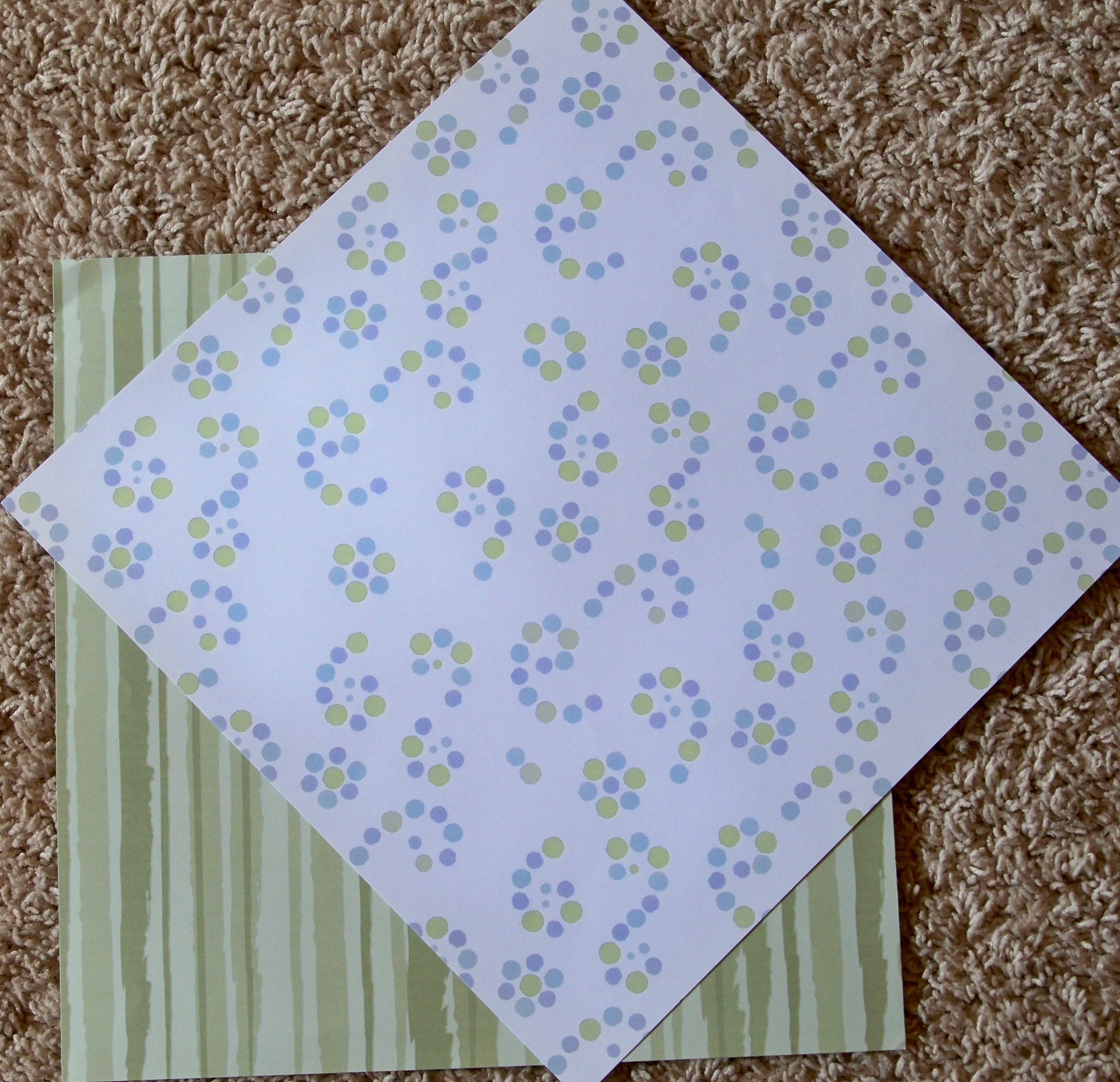
Here’s my before paper:
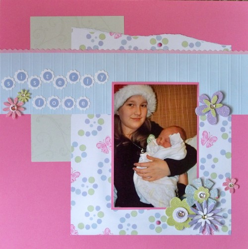
And here’s the layout that I came up with:
Supplies used: CTMH Paper Pack, CTMH Cotton Candy cardstock, CTMH Cotton Candy ink, CTMH So Blessed stamp set, CTMH Playful Flourishes stamp set, DCWV alphabet stickers, Versamark ink, CTMH brads, K & Company Grand Adhesions, and Heidi Grace Velvet Borders.
I did a few things to change the papers.  First, I randomly stamped the pink butterfly onto the patterned paper.  This added more color.  I always like pink and the original shades of color were too pale for my taste.  I also added a few pink brads to this paper.  The green striped paper I used the back side and stamped flourishes with Versamark ink which gave it the look of a watermark.  This is a great way to add a subtle pattern without overpowering your layout.  Another way to do this is to stamp tone-on-tone by using the same color ink as your paper.  You will get a similar effect.  The blue paper is not included in my before photo but it was polka dot in the same colors and again I used the back side.  I really don’t like using solids anymore so to add a bit to this paper I embossed it with my scoreboard.   Overall the layout still seems a bit plan to me but I think it’s the solid background that I chose so I’m just letting it be.


Great layout Wendy!! You used a lot of techniques to alter your papers!! I agree with you about the dotted paper (I still have some in my stash) it needs more!! The butterfly was the perfect addition (: I love the dry embossing you did as well!!! Have a great Easter weekend!!
The addition of the butterflies to your paper made it so much prettier! Great lay-out!