CTMH Technique Blog Hop – Pattern Switch
Welcome to this month’s CTMH Technique Blog Hop.  For this hop we have each chosen a layout design from the Spring/Summer 2014 Idea Book and swapped it so if it’s a card we made a layout, and if it was a layout we used it to create a card.  This is lots of fun, give it a try!  If you have already started the hop, you should be coming from Joy McHargue.
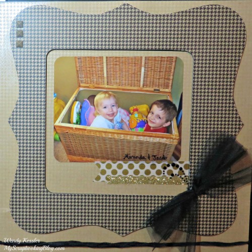
 Supplies used: Black Cardstock, Fundamentals Basic Assortment, Gold Polka Dot Washi Tape, Gold Shimmer Trim (exclusively available in the Ivy Lane Workshop on the Go Kit), Black Tulle (retired), Embroidery Floss (retired), Square Durables (retired, but Triange Studs are available), and Sparkles Black Flourishes – Small.
I found inspiration on page 32 of the 2014 Spring/Summer Idea Book.  I used this 3D item as the basic idea (sketch) for my layout!  I started by cutting the frame shape (You can find detailed instructions on how to do that here).  I used both the front and backside of the Fundamentals Paper after I cut so I didn’t have any waste.  I mounted these pieces on Black Cardstock and used 3D Foam Tape to ad some dimension to the “frame”.  For the “ribbon” across the bottom of the page, I twisted the tulle, wrapped it around the page, attaching on the back nwith tape, and then adding a couple glue dots on the front.  For the “bow”, I folded the tulle in half hotdog style, then folded it back and forth the other way to create the bow.  Holding it together, I then cut the loops and tied the center with embroidery floss.
This was a very different layout for me.  I work much better with girly layouts!  I’m please with it but it’s funny because I knew what I wanted to do and that I wanted to use the Fundamentals Paper but when I went to choose my paper this was the one that I liked best (when I was originally unsure if I would use that paper at all when I flipped through them!).
Now hop on over to Michelle Loncar!
List of participants:
1.  Debi
2.  Shirley Ross
3.  Sheila Bennett
4.  Joy McHargue
5. Wendy Kessler
6. Michelle Loncar
7. Judy Faye Garner
8. Michelle Battitori
9. Terry Morrow
10. Melissa Robinson


Your layout looks really good. Love the tulle bow. It added just the right touch.
Love what you did with the frame and the pic is soooo cute.
Really love the neutral colors of your page. The Paper Fundamentals looks great as the large bracket frame.
cuties! I thought it WAS the frame at first.
Great layout and wonderful take on the theme!